skip navigation Logo and link to home page

This Module:
Next page
Previous page
Beginning of module
Contents of this module

Principles of Animal Behavior:
Home
Modules
Contents
Links
Behavior News
Site Tour
About
Credits

 
Previous | Next

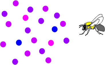
Does this look a bit familiar?

The "peak shift" of the Hanson experiment might remind you of the "utility curve" from the signal detection slide show.

Image: line graph of utility as a function of color. Maximum utility peak shifts further away from the negative signal when the payoff for missed detection is increased.

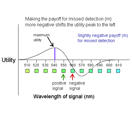
If the positive and negative signals overlap, the most "useful" signal may not be directly over the positive signal, but shifted away from the negative signal.

And as you saw in the slide show, increasing the danger of confusing the signals (for example by increasing the penalty for missed detection) causes the peak to shift even further away.

What does the "peak shift" have to do with animals making decisions out in the real world?

Image: Drawing of a bumblebee facing colored disks with a range of colors.

    Previous
Top of page
Next

This module: Start | Contents
Principles of Animal Behavior: Home | Modules | Contents | Links | Behavior News
Problems using this page? Email the webmaster